
This week's pick is...
 VS.
VS. 
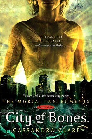
Original Redesign
I admit it. The only reason why I like the redesign is because I hate covers with shirtless guys on them! Really, I almost didn't read City of Bones because of that cover.
Final Verdict: Redesign
Final Verdict: Redesign
Do you agree? Give me your thoughts on which cover is the best!
Overall, I like the new cover better... Not big on how the title looks though
ReplyDeleteI agree. The font is plain and the color is a very unflattering yellow, but anything is better than overly buffed shirtless dude.
DeleteI HATE the yellow color used on the title for the new cover. If it weren't for that, I'd pick it all day, every day. And ohmygosh I agree. Shirtless guys on covers are so lame. I've skipped a lot of books because of that!
ReplyDeleteNew cover is way better. I was never really fond of the original cover as it really had nothing to do with the book. A shirtless guy and a city big deal. But this one has something to do with the book. Even has the tarot cards.
ReplyDeleteI almost didn't read City of Bones because of the topless guy on the cover too! I copped so much teasing from my family members because of that silly cover. Still, not a massive fan of the redesign - mostly because of the colour of the title.
ReplyDelete