
This week's pick is...
 VS.
VS. 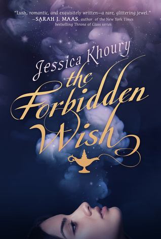
Original Redesign
I admit that the dots on the original are obnoxious, but I just don't like the placement of the face on the redesign. Or the fact that there's a face in general. I always prefer covers without people on them, okay. I would like the redesign if it weren't for the face. The font is pretty and the background brings a nice contrast, but that face ruins it for me (although, maybe it would be too simple without it?). Anyway, I like the colors in the original and it's still very obvious what it's about.
Final Verdict: Original
Final Verdict: Original
Do you agree? Give me your thoughts on which cover is the best!
I like the new cover better... the old one looks really cheesy to me.
ReplyDeleteI like the new cover better... the old one looks really cheesy to me.
ReplyDeleteNew cover better. Love the use of the face blowing the smoke. It's so ethereal looking. I mean polka dots (for the first one)? Really??
ReplyDeleteAlex @ The Book's Buzz
I know what you mean about the face! I'd pick the redesign still though, because the original is too busy for me.
ReplyDelete