
This week's pick is...
 VS.
VS. 
Original Redesign
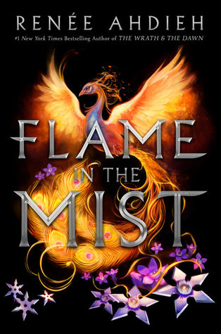
I really like the original cover. It is very eye-catching and has lots of bright colors, though the objects don't quite look like they're in the same space. I like the fact that the redesign actually has the main character's face, but that's it. It's a pretty cover, but I'm honestly not really a fan of monochromatic covers and it does not tell me what genre the book is. Looking at that cover, I might think it's a contemporary book instead of a fantasy. I wish I liked it more because, again, we actually get to see the character's face, but overall the other cover wins because it reads more fantasy.
Final Verdict: Original
Final Verdict: Original
What do you think? Give me your thoughts on which cover is the best!
I like the blue one because It seems that so many books lately are red with flames. Ha ha. I need some tranquility. 😊
ReplyDeleteThat makes sense! Sometimes we all need some tranquility! :)
DeleteOriginal, but I do like the teal of the redesign.
ReplyDelete