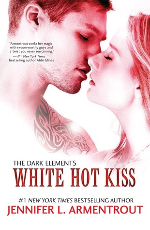
This week's pick is...
 VS.
VS. 
Original Redesign
Jennifer just can't please the cover gods. I honestly hate both of these covers. I thought the original was a New Adult romance at first, when it's actually a YA paranormal. The cover doesn't hint at that AT ALL! Also, I hate it when covers have people kissing or almost kissing on it. Ick. But it's better than the redesign. Not only does it STILL look like a New Adult romance, but it looks like it's an indie book or even a novella. It's as bland as a novella and it's a cover that an indie author with little budget could easily make themselves. At least the original has color.
Final Verdict: Original
Final Verdict: Original
Do you agree? Give me your thoughts on which cover is the best!

Frankly, I'm not a big fan of any guy on the cover. I agree with you though, the original is better.
ReplyDeleteHave to admit that the only JLA cover I can stand is the American version of Don't Look Back. Even the cover I had to read it with was pretty awful (https://www.goodreads.com/book/show/20658346-don-t-look-back).
ReplyDeleteI thought the covers for this series couldn't get any worse, but that redesign is atrocious...I don't understand how someone thought that it looked good?
Sorry that this was such a rant-y comment!