
This week's pick is...
 VS.
VS. 
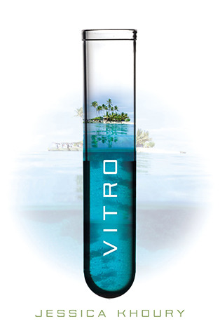
Original Redesign
Both of these are great covers, but I have to go with the original. Don't get me wrong, the original is pretty, but it's too pretty if that makes sense. It doesn't look like the dark sci-fi inside. If it weren't for the test tube in the title, nobody would even be able to guess that it's a sci-fi. The original cover matches the book more closely. It has a more sci-fi vibe and it doesn't mislead you into thinking that this will be a happy book. It's also a wonderful blue color.
Final Verdict: Original
Final Verdict: Original
Do you agree? Give me your thoughts on which cover is the best!
I agree, the original seems more dramatic and I can almost guess what the book is about. As with the other one I feel like it's cheesy, about a couple who can't have babies, or something like that.
ReplyDeleteI agree. I much prefer the original. The redesign looks kind of like a romance novel to me.
ReplyDeleteMonique @ Mo_Books